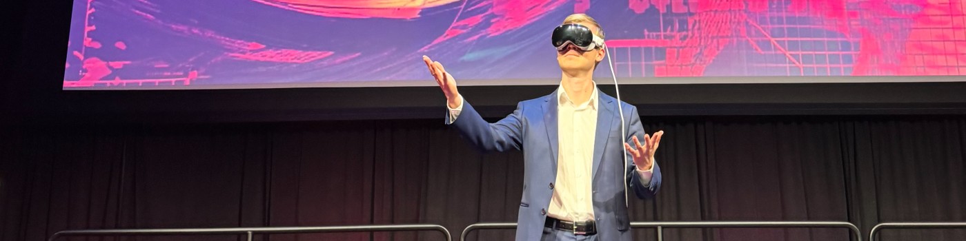
Apple Vision Pro is awesome, but also a little bit mysterious!
When it was first announced, I wondered how regular websites would work while using the headset. I had questions like:
- How can I make sure my website looks good on Vision Pro?
- How can I detect if someone is visiting my website using a Vision Pro?
- How can I make my website stand out for Vision Pro users?
We'll be learning the answers to each of these questions today, plus a lot more!
I recently gave a talk at an Amazon developer conference on this topic, and I wanted to share my learnings here with you. This article is intended for developers of all levels, so no matter where you're at, you'll be able to learn a new thing or two.
In this article, we'll go over best practices for making your site look great on Vision Pro on the web. We'll also do a deep dive into some Vision Pro-specific features so you can take your website to the next level for Vision Pro users.
What is the Apple Vision Pro?
It's a spatial computing headset that blends the digital world with the real world, creating both augmented reality and virtual reality experiences. When you put on the headset, it seems as though you're looking through it, but you're actually looking at two very small high-quality screens that show videos of the world around you, captured by the device's 12 cameras.
To interact with things in Vision Pro, you simply look at them and tap your fingers together. It's incredibly easy to use and intuitive. To scroll, just pinch your fingers and swipe.
The Vision Pro comes with an all-new operating system: visionOS. While this might seem impressive and intimidating, Apple actually started with iPadOS to create visionOS and modified it a lot.
So in reality, it's just like iPadOS, but if your iPad could float and you had a lot of them.
Let me give you a visual to explain this a bit more.
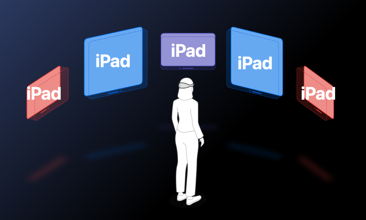
This is what it might look like while wearing Vision Pro. You have all these floating windows that are essentially iPads. You can move them, resize them, and place them wherever you want. But for our purposes, we're going to imagine that all your apps and windows in visionOS are just floating iPads.
Best Practices for Vision Pro
Let's dive into some best practices to make sure your website is ready for the Vision Pro. But I know you might be wondering, why should I optimize my website for Vision Pro users? That's a good question.
There are only a few hundred thousand Vision Pro users worldwide right now, which is a very small market compared to the 7 billion smartphones or the 2 billion PCs out there. The number of Vision Pro users is sure to grow over the next few years, but it's very small right now, so keep that in mind when deciding if you should take extra steps to optimize your website for Vision Pro users.
But one more thing to consider is who these early adopters of Vision Pro are. These are people who aren't afraid to try new tech. Some of these people are thought leaders who might share their experience on social media to their audiences. While the total size of users might be small, it could be beneficial to cater to this group of power users.
Testing Without a Vision Pro
But what if you don't have a Vision Pro? How can we test it without having one? The Vision Pro starts at $3500, which is pretty pricey!
If you're not ready to purchase one, you can use the Vision Pro Simulator for free if you have a Mac. The simulator allows you to test out your website as if you had a Vision Pro. You can use your mouse to simulate the interactions a user would see as they look at elements and tap on them, but you can do the same by clicking.
Best Practices for All Platforms
The good news here is that the best practices I'll go over first actually apply for all platforms. So whether you're building a website for desktop, mobile, iPads, or anything in between, these tips will help your website look great everywhere.
Most of these best practices are things you might already know, since they apply to creating websites in general, but it's good to go over them again. We'll dive into some of these in more depth in a bit.
- Make sure you're using CSS viewport units when constructing your layouts so your content fits the window, no matter the size.
- Media and container queries still apply here, since users can resize their windows whenever they want.
- Use vector graphics with SVG to ensure that your icons and graphics look great on any window size, even when the window is up close.
- Make sure you're using responsive images that adapt to the window size.
- Use semantic elements to help usability and accessibility across all platforms.
- And finally, you'll need to make sure your full-screen content adapts to windows of any size and orientation when users resize them.
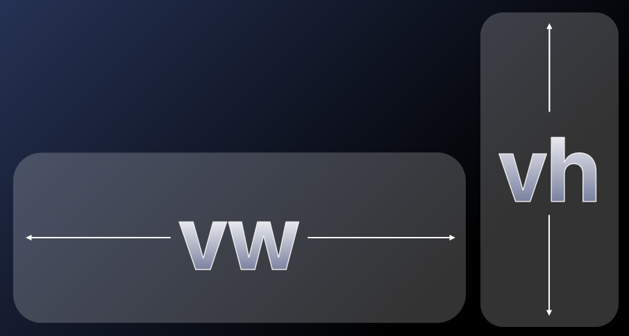
CSS Viewport Units
CSS viewport units are a set of units, similar to pixels, that help you size your content
according to the size of the viewport that your website is in. The most commonly used viewport
units are vw, which are viewport width. Each vw is 1% of the
viewport width, so 100vw is 100% of the viewport width. vh is
similar—each vh is 1% of the viewport height.
.class {
    width: 10vw; /* 10% of viewport width */
    height: 10vh; /* 10% of viewport height */
}
There are a lot more new units that have come out recently to help with mobile platforms, such
as those with the lv and sv prefixes. These help to address problems
when viewport size changes if different parts of the UI are visible. Here's a link to dive deeper into this topic.
Media Queries
We can use media queries in CSS to detect the pointer precision and hover support. visionOS is very similar to iOS and iPadOS because its pointer is coarse and it doesn't support hovering. You can use these CSS media queries to customize the look of your site if users are using a pointer without hover support or fine precision.
/* Pointer precision */
@media (pointer: coarse) {
    /* visionOS, iOS, iPadOS */
}
/* Hover support */
@media (hover: none) {
/* visionOS, iOS, iPadOS */
}Semantic Elements
In HTML, using semantic elements greatly improves accessibility. In the not-so-great example below, everything is made out of divs. While this can produce a working website (since you can customize the look and behavior of every element), it's not a good practice and is terrible for accessibility. This is known as div soup because all the divs sort of blend together and look like one big mess of soup.
<div class="container">
    <div class="header">
        <div class="item">Item 1</div>
        <div class="item">Item 2</div>
        <div class="item">Item 3</div>
    </div>
    <div class="content">
        <div class="title">My Title</div>
        <div class="text">Hello!</div>
        <div class="button">Subscribe</div>
    </div>
    <div class="footer">
        My footer text
    </div>
</div>A better way to do this is to use the correct semantic elements in your HTML. Below, you can see that I've updated my header to actually use the header element, as well as using an unordered list element for all my list items inside it.
<div class="root">
    <header>
        <ul>
            <li>Item 1</li>
            <li>Item 2</li>
            <li>Item 3</li>
        </ul>
    </header>
    <section class="content">
        <h2 class="title">My Title</h2>
        <p class="text">Hello!</p>
        <button>Subscribe</button>
    </section>
    <footer>
        My footer text
    </footer>
</div>I've also created a section for my content, where I have a second-level heading with my title and a paragraph after it, as well as an actual button at the end. Semantic elements also can help your search engine optimization by helping search engine crawlers figure out what is important on your site, instead of everything being soup.
Full-Screen Content
When it comes to full-screen content on Vision Pro, there are a few crucial things to know. Let's say that you're looking at a website with a video on it. You tap on the video to enter full screen, which makes the video expand to fill the entire window. Normally, this would be straightforward to handle.
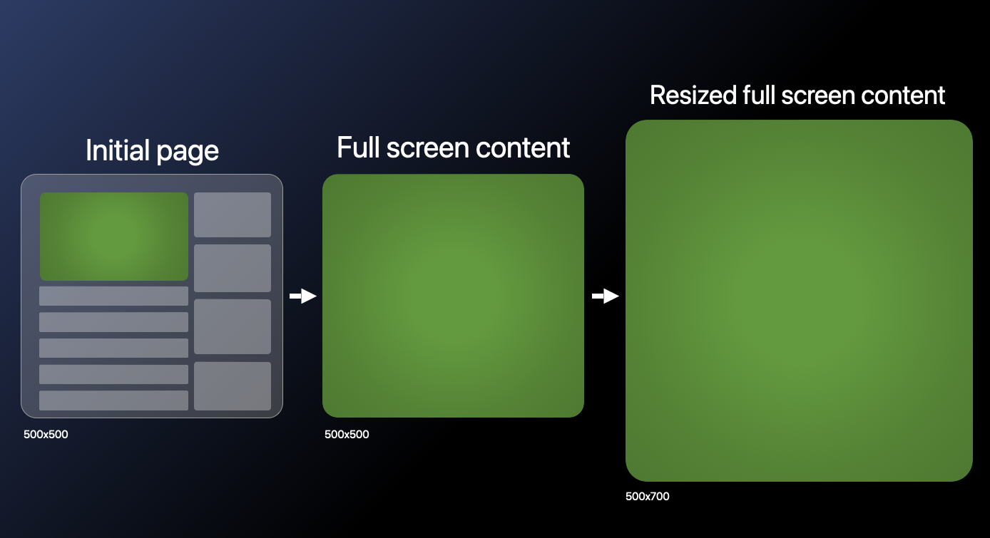
However, full-screen windows can also be resized on visionOS, so even after going full screen, the size of the video could change. Make sure to account for this behavior if you have any full-screen elements. For example, if you're storing the width and height of the video when it goes full screen, you will need to make sure you update those values if the size of the viewport changes.
While this mostly just applies to Vision Pro, this could happen on other platforms. For example, if a tablet allows you to use apps in a split-screen mode and full screen one of those apps, this scenario could occur when resizing the split screen.
Optimizing Animations and Scrolling
Let's go over a few optimizations to make sure your website's animations and scrolling are smooth. On Vision Pro, every animation will target the highest frame rate possible, which is usually around 90 frames per second.
Passive event listeners for scroll will prevent your animations from interfering with
scrolling, and when using requestAnimationFrame, make sure to take the elapsed
time between each frame into account.
Passive Event Listeners
If you're tracking touch or scroll wheel events, the page will wait until your listener code finishes before continuing the scrolling. Browsers do this because they can't know if your code will prevent scrolling in some cases, so they have to wait for your code every time.
const onTouchStart = () => {
	// Expensive logic in here
}

document.addEventListener("touchstart", onTouchStart);If your code doesn't interfere with scroll behavior, you can greatly improve the performance of your site by making your event listener passive with a simple change. Browsers won't wait for your code to finish executing before continuing scrolling, so users will enjoy a buttery smooth scrolling experience on your site. Learn more about passive event listeners.
document.addEventListener("touchstart", onTouchStart, {
	passive: true,
});requestAnimationFrame
Let's look a bit closer at how we can ensure that requestAnimationFrame runs smoothly independent of frame rates.
const animationDuration = 300; // milliseconds
let animationProgress = 0;
let lastUpdate = Date.now();

const animate = () => {
	const now = Date.now();
	const delta = now - lastUpdate;
	lastUpdate = now;
	animationProgress += delta / animationDuration;

	// Update animation with animationProgress
	if (animationProgress < 1) {
		requestAnimationFrame(animate)
	}
}
animate();
In this example, we're animating a value from 0 to 1 over 300 milliseconds. Our animation's current value is stored in animationProgress, and is updated using requestAnimationFrame. In our animate function, we're updating animationProgress based on the elapsed time delta between this frame and the last animation frame.
This ensures that our animation always completes in 300 milliseconds, and is a great way to ensure smooth animations on all platforms, not just visionOS. If we didn't measure the time between frames, we would end up with a framerate dependent animation, which could be very slow or very fast depending on the user's device.
Vision Pro Detection
Now, let's dive deeper into some Vision Pro specific behavior. How can we detect if someone is visiting my site with a Vision Pro?
User Agent
There are a lot of possible ways to check if someone is using a Vision Pro. The first is to check their user agent, which unfortunately is the exact same as an iPad's user agent.
Max Touch Points
Another approach would be to check navigator.maxTouchPoints, which indicates the
maximum number of simultaneous touch contact points that are supported on the current device.
Seems like that could be useful, right?
Unfortunately, it always returns 5, which is the same as an iPad. Yes, the Vision Pro really is just a bunch of floating iPads.
Refresh Rate
We can also try refresh rate, since the Vision Pro might have a higher refresh rate than an iPad. However, iPads can actually have a refresh rate of up to 120 hertz, and the Vision Pro's refresh rate is usually around 90.
This means that there is overlap in their framerates, so we can't reliably detect if someone is using a Vision Pro.
Not a Solution
However, I wanted to see if it was possible to get close to Vision Pro detection, and here are my results.
const isVisionPro =
	navigator.userAgent.includes("Macintosh") &&
	navigator.maxTouchPoints === 5 &&
	navigator.hardwareConcurrency === 8 &&
	averageRefreshRate > 85 &&
	averageRefreshRate < 95;
By combining everything we've tried previously, this hacky solution is somewhat able to detect if someone is using a Vision Pro. This code shouldn't be used in production and will probably stop working sometime in the future as more updates for Apple devices come out.
This approach checks for the "Macintosh" string in the user agent, then also checks that maxTouchPoints is equal to 5. By this point we know it's either an iPad or a Vision
Pro. We also check hardware concurrency since it's equal to 8 on the Vision Pro (and somehow also
8 on iPads).
The magic here is to check the average refresh rate. The Vision Pro's framerate is usually between 75 and 100 frames per second, so if we average it out, it usually is about 91 frames per second.
Based on my testing, while iPads can have frame rates of up to 120 frames per second, most of them are usually around 60. This means that using average refresh rate somewhat works to detect if it's a Vision Pro or not.
But keep in mind that this is a very fragile approach and shouldn't be considered a solution. The best practices mentioned earlier will help you make your site look great on any platform, whether it's on Vision Pro or not.
Gaze Tracking
We've gone over how hovering in CSS isn't supported - but can we track where someone is looking on our website?
I want to know when they're looking at specific elements so I can enhance my analytics or add special animations. Wouldn't it be great if websites could know if we glanced at an ad for half a second so they could immediately show us more of the ad?
No? Well, Apple didn't think so either. Gaze tracking isn't supported at all in CSS or JavaScript, meaning you can't track where someone is looking on the website at all.
Remember: this is just a floating iPad, and iPads can't see what we're looking at on a website, either.
Gaze Highlights
But if we can't apply hover effects to buttons when users look at them, how do users know if they're looking at the right elements before interacting with them?
This is where visionOS's gaze highlights come in. This is a feature built into visionOS and isn't available to any apps, including Safari.
Gaze highlights show a soft highlight effect on any interactive regions on a page, such as buttons, links, menus, elements with equivalent ARIA roles, and input fields and forms.
You can even use the CSS cursor: pointer to make sure gaze highlights appear on specific
elements. But don't let that tempt you into using divs everywhere! Use the proper semantic elements
when possible.
If you look closely, you can see the subtle gaze highlights in the video here. Notice that as the user looks at each of the elements on amazon.com, there's a soft shimmer or highlight effect that's applied to them.
Optimizing for Gaze Highlights
Let's dive deeper on how we can optimize our website for the best usage of gaze highlights. We can customize the shape of the gaze highlight by adding a border radius to our list element.
button {
	border-radius: 16px;
}
The gaze highlight will take any border radius you specify in CSS into account for its shape. If you don't give a border radius, it will have a slight border radius by default. (as we saw previously on amazon.com)
Setting the border radius is the only way to customize how the gaze highlight looks. We aren't able to set the border, background color, or any other properties of it.
So just to be clear, CSS hover styles don't work with Vision Pro. Nothing happens when the user looks at elements with hover styles. The only way to customize the built-in gaze highlight is to adjust the border radius of your interactive element.
Pointer Events
I mentioned earlier that because the Vision Pro is essentially a bunch of iPads, we can't
track where the person is looking. This is true, but once the user taps their fingers
together, a pointerdown event is sent to the browser.
// First, the user taps their fingers to start interacting
window.addEventListener("pointerdown", (ev: PointerEvent) => {...});

// Next, the user looks around while holding
window.addEventListener("pointermove", (ev: PointerEvent) => {...});

// Finally, the user releases
window.addEventListener("pointerup", (ev: PointerEvent) => {...});
While their fingers are together, looking anywhere on the page will send pointermove events, similar to if you were to drag your fingers around on an iPad.
Once their fingers are released, the pointerup event is sent, and no more pointermove events are sent.
Pointer Events in Action
This might be a little difficult to visualize, so let's look at an example. In video below,
I've opened a drawing website in Vision Pro. By tapping my fingers together, it emits a pointerdown event, which starts the drawing.
Then, while my fingers are still together, I look around to draw on the canvas. This uses the pointermove event, which is possible while my fingers are still together.
And finally, at the end of each line that I draw, I release my two fingers to stop clicking on
the canvas. This ends the pointermove event and emits a pointerup event.
One thing to note here is that because the website doesn't receive pointermove events
until we tap our fingers together, it can't show us where we are looking on the canvas.
Integrating 3D Content with Quick Look
Now let's talk about how to integrate 3D content in your website. While these tips are mostly aimed at Vision Pro users, adding this capability in your site will also enable iOS users on Safari to view 3D content in AR in their own space.
We can do this with AR Quick Look. We're using an anchor element pointing to the 3D model,
which must be in usdz format. Note the rel="ar" property - this signifies
that we shouldn't navigate to the link, but open up the 3D model instead.
<a rel="ar" href="models/camera.usdz">
	<img src="models/camera.png" alt="3D camera model" />
</a>
While on a website, users will see a preview image of the 3D model. When the element is tapped, it will load the 3D model in their own space so they can preview it. Users can move, rotate, and scale it. We can see this in action in the video below.
In the above video, I have my website opened on Vision Pro. By tapping on the element we created on the last slide, we can open the 3D model and interact with it in our own space in 3D. We can move it, rotate it, and scale it to make it as big or small as we want.
If someone clicks the element on an unsupported platform, it will just open the link to the element directly, causing them to download the 3D model to their device so they can open it locally in a viewer of their choice.
Experimental APIs
There's also an experimental model element being considered for the web for
adding 3D content to webpages. You can learn more here and here.
Next Steps
If you've made it here, congrats! Give yourself a pat on the back for reading this article and learning today.
What we've covered in this article only scratches the surface of what's possible in the web for Vision Pro. You can create entire AR or VR experiences and games using WebXR frameworks (all in the web!). The possibilities are endless.
So get out there, and start creating! And please let me know what you're making! I want to see all the awesome things people come up with.
Ben Ank
Last Updated
July 19, 2024